In luxury interiors, color is not merely decorative but a tool for managing perception, balance, and spatial depth. This guide explains the role of color theory in high-end interior design.
In luxury interior design, color is not applied to decorate surfaces but to control spatial perception. A well-constructed color scheme can make a space feel larger, more balanced, or more profound. For this reason, color theory is a fundamental component of luxury design.
The Perceptual Power of Color
Colors influence how dimensions and proportions are perceived. Light tones visually expand spaces, while darker tones create a sense of depth. In luxury interiors, this effect is applied deliberately, with color supporting architectural intent.
The Role of Neutral Palettes
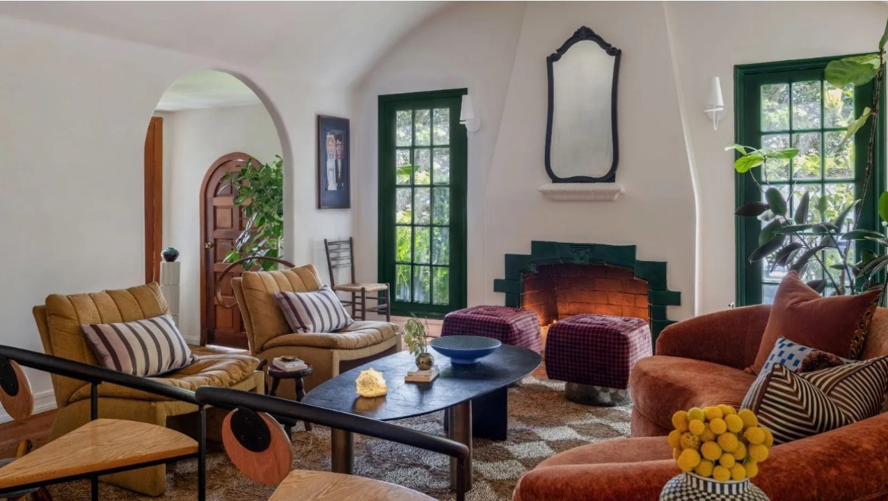
Neutral palettes form the foundation of modern luxury interiors. Beiges, greys, and earth tones bring a quiet strength to spaces. These palettes ensure timelessness and allow textures and materials to take precedence.
Contrast and Balance
In luxury design, contrast is used to establish balance rather than attract attention. Controlled transitions between light and dark tones add depth. Excessive contrast disrupts spatial cohesion.
The Relationship Between Color and Light
Color must be evaluated alongside lighting conditions. Natural and artificial light affect how tones are perceived. Therefore, color selection should be integrated with the lighting plan.
Timeless Use of Color
Trend-driven colors fade quickly. Luxury interiors favor tones that maintain relevance over time. Timeless color application enhances the long-term value of a space.
In conclusion, color theory in luxury interiors functions as a strategic tool that shapes spatial perception. Proper color balance elevates both visual clarity and experiential quality.